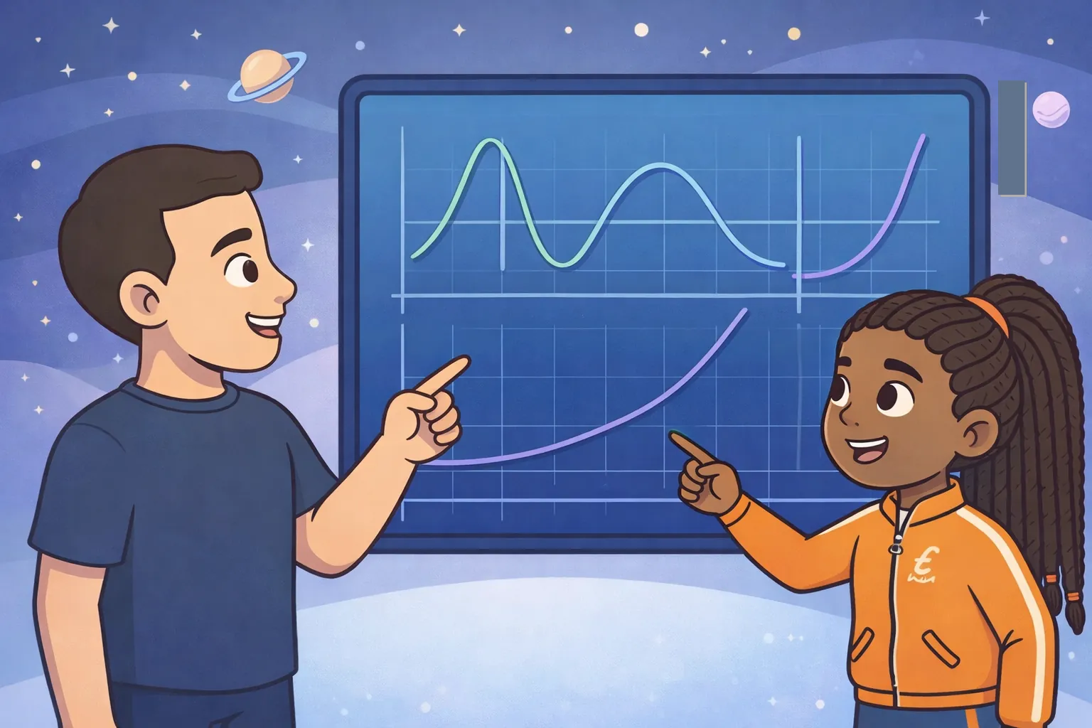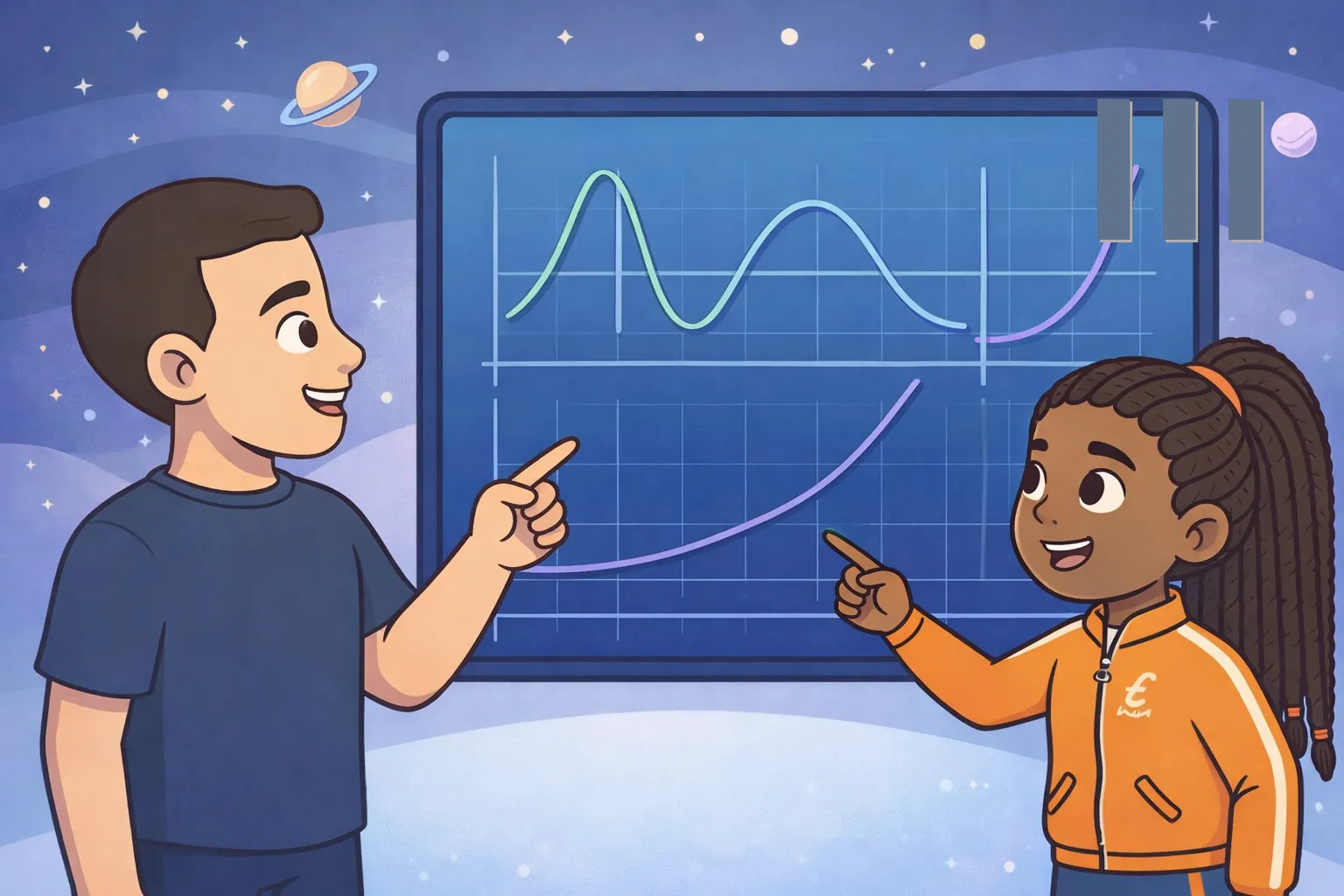

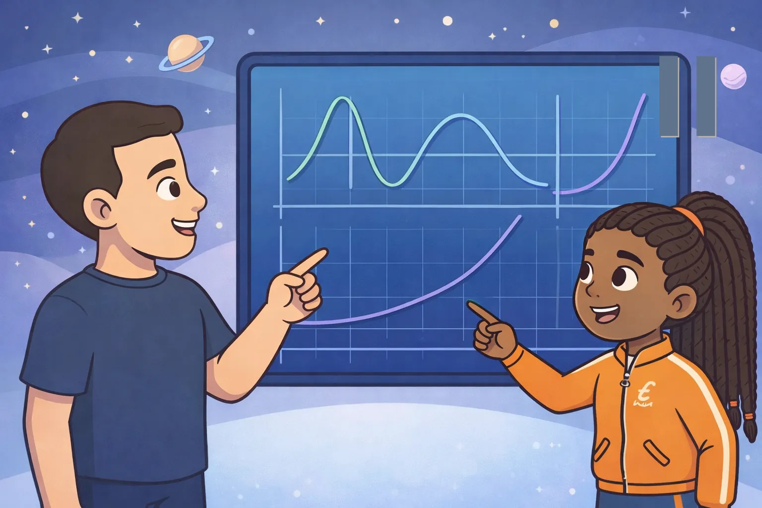
At a planetary research station, Emek and Tara received several function graphs predicting how the atmosphere would change over the coming weeks. Each model showed different trends, turning points, and rates of increase or decrease across important time intervals. They compared the graphs with recent atmospheric measurements, paying close attention to which model matched the observed behavior instead of only individual data points. After interpreting the graphs over the full range of the mission timeline, they identified the model that best represented the planet's changing climate. Their recommendation helped mission planners prepare safe exploration activities before the next expedition began.
Challenges
Challenge 1 of 5
Challenges
Challenge 1 of 4
Hint
Find the t-coordinate of the vertex using t = -b/(2a).
One climate model is represented by f(t) = -t² + 8t + 3, where t is the number of weeks after observations begin. During which week does the model reach its maximum value?
Week 2Week 4Week 6Week 8Correct! The model reaches its maximum at week 4.
Find the vertex of the downward-opening parabola.
Next🎉 Congrats! You got this question!
Hint
Divide the change in the measured value by the change in time.
Recent measurements increased from 18 units at week 2 to 42 units at week 8. What was the average rate of change, in units per week, over this interval?
Correct! The average rate of change was 4 units per week.
Subtract the measurements, then divide by the number of weeks between them.
Next🎉 Congrats! You got this question!
Hint
Identify what type of turning point occurs when a graph changes from increasing to decreasing and then from decreasing to increasing.
Atmospheric measurements rise until week 3, fall from week 3 to week 7, and then rise again. Which model best matches this behavior over the full mission timeline?
A model that increases for the entire timelineA model that decreases until week 3 and then increasesA model with a local maximum at week 3 and a local minimum at week 7A model with a local minimum at week 3 and a local maximum at week 7Correct! The graph has a local maximum at week 3 and a local minimum at week 7.
Match each change in direction with the correct type of turning point.
Next🎉🎉🎉🎉🎉🎉🎉🎉
🎉 Congrats! You finished this challenge set!